
A 7-Step Web Design Guide For Small Businesses
A Letter From Your Web Designer Who Refuses to Gatekeep
The honest truth is that every entrepreneur is so creative and scrappy that they could DIY their website if they really wanted to. I know I’m a web designer, but I’d rather be honest than lie just to land a sale. So here we go!
Building a quality website takes time, effort, and skills. If you’ve ever tried to DIY your website and found yourself buried under a million tabs, 23 hours of Youtube tutorials, and the sudden desire to throw your laptop out the window… you know that dang well. The website world is full of jargon, conflicting advice, and gatekeeping that makes business owners feel like they need a brand new dictionary to figure everything out.
However, building a strong, strategic website doesn’t have to feel like solving a Rubik’s Cube blindfolded. With the right steps, time available (and zero gatekeeping), you can create a website that not only looks beautiful, but actually works.
That’s why I created this guide that breaks everything down into seven digestible steps, from strategy to SEO to design to quality assurance. Whether you’re building your own site or planning to hand it off to a designer later, these steps will help you approach your website with clarity, confidence, and direction.
Let’s dive in.
Why Strategy Comes Before Aesthetics (And Why Most Designers Skip This Part)
Before you ever open Showit, Squarespace, WordPress, or whichever platform you love, you need to know two things:
- What pages do you need?
- What purpose does each one serve?
- What flow is each section following?
Most business owners skip straight to the fun part, putting together colors, fonts, and “what template should I choose?”, but a website is not just a digital brochure. It’s a tool. A guide. A journey, so you have to ask yourself a few things:
- What do I want my ideal customer to do on my site?
- Book a call? Browse services? Read articles? Sign up for a newsletter?
- What questions are they asking before they hire someone like me?
- What objections or anxieties do they have that I can solve through words, visuals, or structure?
Once you’re aligned with the main job your site is performing, you can list out the exact pages you need (and eliminate the ones you don’t). For most small businesses, this includes:
- Home – your introduction + first impression
- About – your story, authority, and trust-building content
- Services – clear, detailed breakdown of your offers
- Portfolio or testimonials – proof, case studies, transformations
- Blog – helpful content + SEO fuel
- Contact – the simplest path for inquiries
Your strategy becomes your north star. Everything after this step becomes exponentially easier.
Mapping the User Journey: Creating a Wireframe That Actually Makes Sense
Once you know your pages, it’s time to build a wireframe. Think of this as your website’s blueprint.
A wireframe isn’t pretty, it’s simply a map of where content lives and how users move from one place to the next.
For example:
- What does someone see when they land on your home page?
- What is the first call-to-action you show them?
- Where does that call-to-action lead?
- What happens if they’re not ready to book yet?
- Is there a secondary path for browsers who just want to learn?
When you lay out your site visually, you start to see how your website supports your sales process.
A strong wireframe makes sure your visitor always knows what to do next. There’s no guessing, no confusion, and no wandering around your site like it’s a corn maze.
This step is the foundation of a high-converting website, and yet it’s the most often overlooked. Designers sometimes skip it. DIYers definitely skip it. But if you want a site that guides your user toward a decision, this step is non-negotiable.
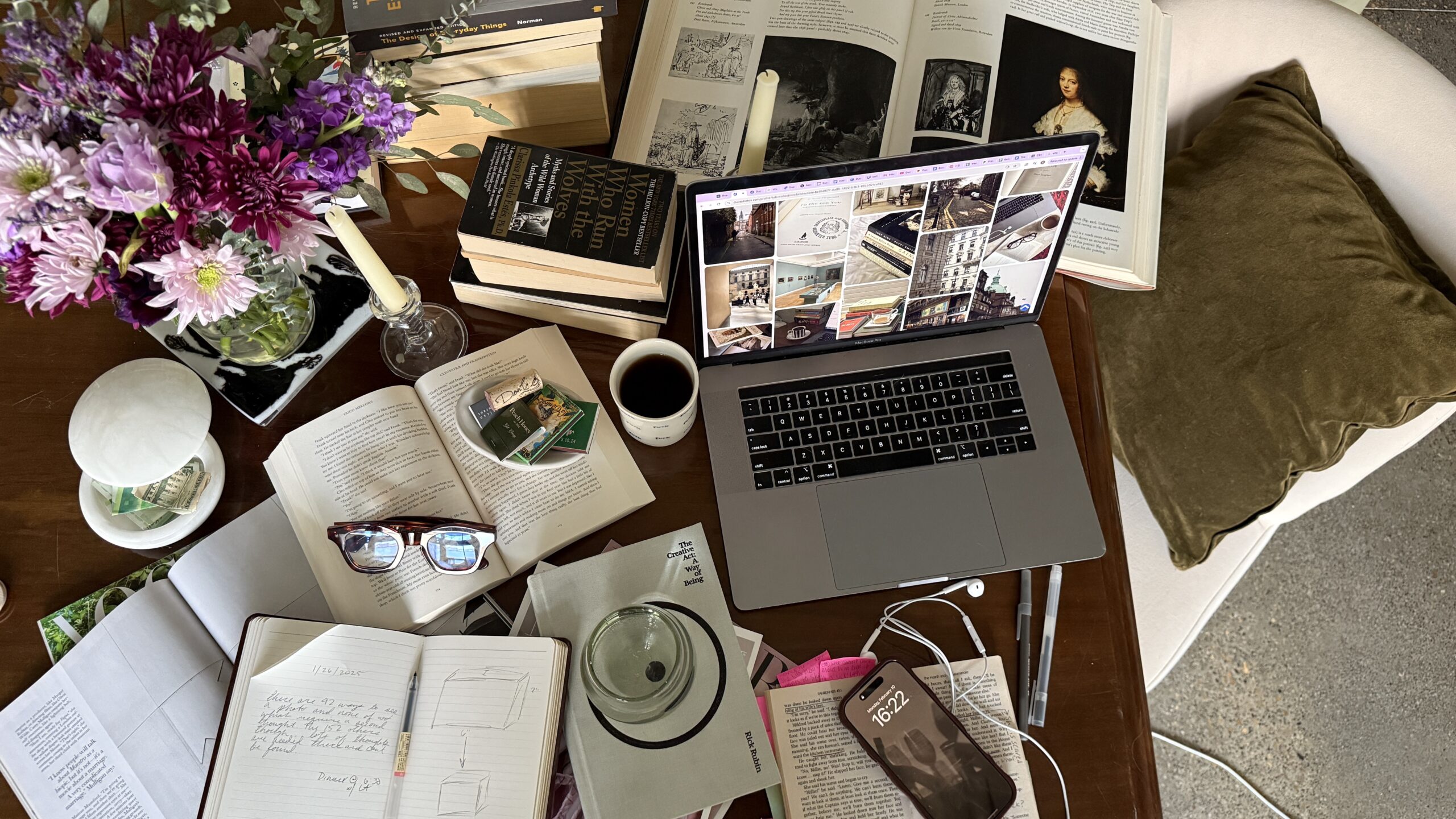
Building Your Moodboard: Bringing Your Website’s Energy to Life
Now the fun part begins.
A moodboard helps you define the tone, energy, and aesthetic direction of your site before you choose a single font or color. It keeps your branding cohesive, aligned, and intentional.
Your moodboard should include:
- Colors that reflect your brand personality
- Fonts or typography inspiration
- Photography style (warm and lifestyle? clean and editorial?)
- Patterns, textures, or shapes
- Website screenshots that inspire layout ideas
- Any brand elements you consistently use
A strong moodboard answers questions like:
- Should your website feel bold and high-contrast?
- Soft and airy?
- Minimal and modern?
- Earthy and grounded?
- Edgy and artistic?
When you choose visuals before you start designing your site, you build with confidence instead of trial-and-error. Every decision you make becomes easier and more consistent.
SEO Isn’t Optional, This Is How You Build a Website That Google Loves
SEO doesn’t have to be scary. It also doesn’t have to be super advanced. But it does have to be intentional.
Before you start writing your website copy, do a little SEO research:
1. What do you currently rank for?
2. What keywords do your competitors rank for?
3. What do you want to rank for?
SEO research is the backbone of strong website copy. This step helps you write with intention, so your content pulls people in organically, not just through social media.
Applying Your SEO to Website Copy (Without Sounding Like a Robot)
Once you know your keywords, it’s time to apply them strategically. This part is less about “stuffing keywords everywhere” and more about creating content that sounds natural and useful.
Here’s where your keywords should live:
- Headers (H1s, H2s)
- Page copy
- Meta titles and descriptions
- Image alt text
- URLs
- Schema markup
Each page should have:
- One H1 (the main title)
- Several H2s that naturally incorporate your keywords
- Clear, skimmable sections
- Calls-to-action that are easy to find and follow
Strong copywriting + strong SEO = a website that’s discoverable and high-converting.
It’s Time For Structure To Meets Storytelling
Now that you’ve done the strategic work, the design stage becomes so much smoother.
Whether you’re building on Showit, Squarespace, WordPress, or something else, your design should follow these guidelines:
- Use consistent spacing and margins
- Break up sections with visual hierarchy
- Keep buttons easy to find and clearly labeled
- Choose photography that enhances your brand
- Avoid clutter, white space is your friend
- Make sure your layout stays aligned on desktop + mobile
Design isn’t just visual, it’s practical. A beautifully designed website that doesn’t convert isn’t a successful one. Your design should help guide the user’s eye and make taking action feel effortless.
We All Skip Quality Assurance + Optimization
The final step that almost everyone forgets…your QA process.
Before your site goes live, take time to:
- Test every button and link
- Check mobile responsiveness
- Check tablet responsiveness
- Run your site through PageSpeed Insights
- Optimize all images
- Confirm all forms are working
- Test your navigation
- Review accessibility (alt text, readable fonts, high contrast, etc.)
This step separates a “pretty website” from a professional one.
Final Thoughts: You Don’t Have to Build Alone
Building a website can feel overwhelming because without the years of experience, all the moving parts can feel chaotic. But it doesn’t have to be a gatekept, confusing process. When you break it down into these seven steps, you create a site that not only looks amazing, but actually works for your business.
And if you’re feeling stuck at any part of the process, (strategy, SEO, design, or anything in between) you don’t have to figure it out alone.
Got questions or want to bounce ideas? Let’s chat!

Born and raised in Brazil, I have always been wired to build. Whether it’s relationships, ideas, or momentum.
")
